When it comes to design, marketing materials such as ads, brochures, print ads, and such are usually the first things that come to mind. Annual report graphic design on the other hand rarely gets the same level of attention.
Many business leaders make the mistake of assuming that annual reports are purely informational, and that the design doesn’t matter as much so long as all the key information is communicated in there.
Make no mistake however, good design is just as (if not more) important for annual reports. Today, our design studio in Melbourne will explain how graphic design can improve your reporting, and why you should start putting serious thought into graphic design for annual reports.
Why does design even matter for annual reporting?
Good design ensures annual reports are an extension of your brand
Effective branding isn’t just about good design (though that’s a major factor) – it’s also about consistency and cohesion. The strongest brands are the ones that put in the work to ensure that their entire visual identity from logos, to typefaces and colours come together to tell a consistent story and image.
While they may not be the first thing that comes to mind, annual reports are an extension of your brand. Therefore, they need to be treated with the same level of care as the rest of your branding to maximise visual cohesion and maintain a consistent brand identity.
The best way to do this is by handing the task of designing your annual reports to a graphic designer – ideally, the same one that handles the rest of your branding for maximum consistency.
Annual reports are important documents, and need to be treated as such
Whether it’s a business’ financial status, its upcoming plans, or detailing the progress of major projects, annual reports convey a lot of important information to key stakeholders like shareholders, regulators, employees, or the general public. Annual reports are often the main window these shareholders get into the internal workings of a business or organisation, and play a big role in decision-making.
As one of the most important documents an organisation will create, it’s important that great care goes into crafting the report. In addition to ensuring the message and data within are accurate, it also means taking great care with the report’s design.
Good design makes reporting clearer
Annual reports can be long, information-dense documents. Balance sheets, project updates, and lengthy analyses can make it easy for readers to get lost in the report and miss out on vital information. There are many ways to maximise clarity and reduce confusion. Good design is one of them.
In addition to making the report more aesthetically appealing, annual report graphic design also increases clarity and reduces confusion. Good design can make reports more engaging, make data more presentable, and help guide readers through the complex information contained within.
Graphic design annual report case study: how MOO took McArthur’s reporting to the next level
The path to a good-looking annual report starts by partnering with a graphic design agency experienced in designing excellent reports and documents.
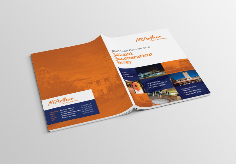
McArthur is a boutique recruitment and HR consulting agency that connects specialist talent to employers in a handful of specific industries, one of which is local government. In addition to providing recruitment services, McArthur also provides insights to its local government clients by conducting research into employment trends across the sector, including an annual remuneration survey and report.
For the 10th year running McArthur have entrusted the graphic design and layout of their annual Remuneration Survey to MOO’s marketing agency.
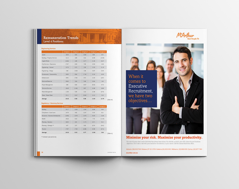
This survey is a comprehensive statistical, graphical and analytical report which communicates important remuneration data to local government. The report contains a raft of complex information. Given the volume of statistics, this layout and graphic design project requires significant attention to detail, and graphic design is extremely important to make the publication needs to be easy to read and visually appealing.


McArthur have an established brand and style guide, which was utilized and reinforced in the design and layout of the report. As a leading provider of services to the local government sector, brand consistency and discipline are paramount. MOO Marketing and Design’s graphic design staff are experts in brand marketing, and were engaged for the creation of new brand style guides and the application of existing brand style guides. This is highlighted in the design of this report.
The report is distributed in printed and digital formats. Our graphic designers have considered how the layout and design will work in both formats. The print version is over 140 pages long. Pre-press of the artwork is detailed to ensure printers have all they need to produce a prestige printed product. The report has been broadly distributed and extremely well received.
Contact MOO’s marketing and graphic design agency for annual report graphic design
An annual report isn’t something you can cut corners on. Designing a visually-compelling, easy-to-read annual report starts by partnering with a graphic design agency with experience in designing reports.
Here at MOO, we offer a broad suite of marketing agency services in Melbourne. Naturally, that includes designing a visually-compelling, easy-to-read annual report.
MOO is a leading Marketing and Graphic Design Agency in Melbourne. We have the unique ability to apply proven marketing principles to graphic design. This helps to create an easy to navigate and read report containing data tables, graphs and analysis.
Additionally, our range of services also include:
- Brand design services
- Copywriting for reports, surveys, and advertising publications
- Brochures
- Infographics
- Promotional material
- Brand style guides
- The full suite of digital marketing services
Looking to spice up your next annual report? Contact us here. We’d love to hear from you.
